
Veeva Network
Veeva Network is a data management software designed for the life science industry. It provides real-time customer data for pharmaceutical companies. I joined the team in 2014 as the first designer to lead the end-to-end design process from user research to UX strategy, interaction flows, UI styles, and usability testing. It’s been an amazing journey to watch the product grow from a database of healthcare professional and organization records to a fully-fledged customer master data solution used by top pharmaceutical companies around the world.
Challenges
Veeva Network UI was initially designed by a group of engineers, which worked well until it had to scale. I started by conducting a design audit of the web application to understand the product and identify existing problems.
Confusing site navigation.
Inconsistent UI components and patterns.
Fixed layout unable to adapt to different screen sizes.
Lack of design foundation and brand identity.

Veeva Network old UI
Establishing a design system
With many new feature designs planned, it was easier to redesign new UI components and layouts rather than trying to design on an increasingly dated system. I realized a design system is crutial to establish a design language for Veeva Network, and make the user experience consistent across features. I created new UI components, defined the overarching visual design language and interaction patterns. With the style guide and UI component library, our teams were able to ship new features and scale the design more quickly.

Redefining data stewardship
Network Inbox is designed for data stewards to process data change requests (DCR) for healthcare provider records in order to keep data accurate and up-to-date. However, user feedback was that the Inbox was not efficient. My task was to redesign the Inbox to enhance stewardship experience and productivity.
Field research and insights
I conducted field research at one of Veeva's data centers and identified data stewards’ main pain point was unable to filter DCRs by attribute. When processing DCRs, data stewards need to contact administrators at the hospital department to verify healthcare providers' information. Therefore they want to quickly identify tasks assigned to them, then group requests related to the same entity together, so they can cross-reference data and minimize the time to call the hospitals.

Old Inbox UI
Inbox redesign
Based on the insights, I came up with a table view design for the inbox main view that allows users to add any attribute as a column. Each column header comes with the corresponding filter, which allows users to easily filter DCRs by any attribute.
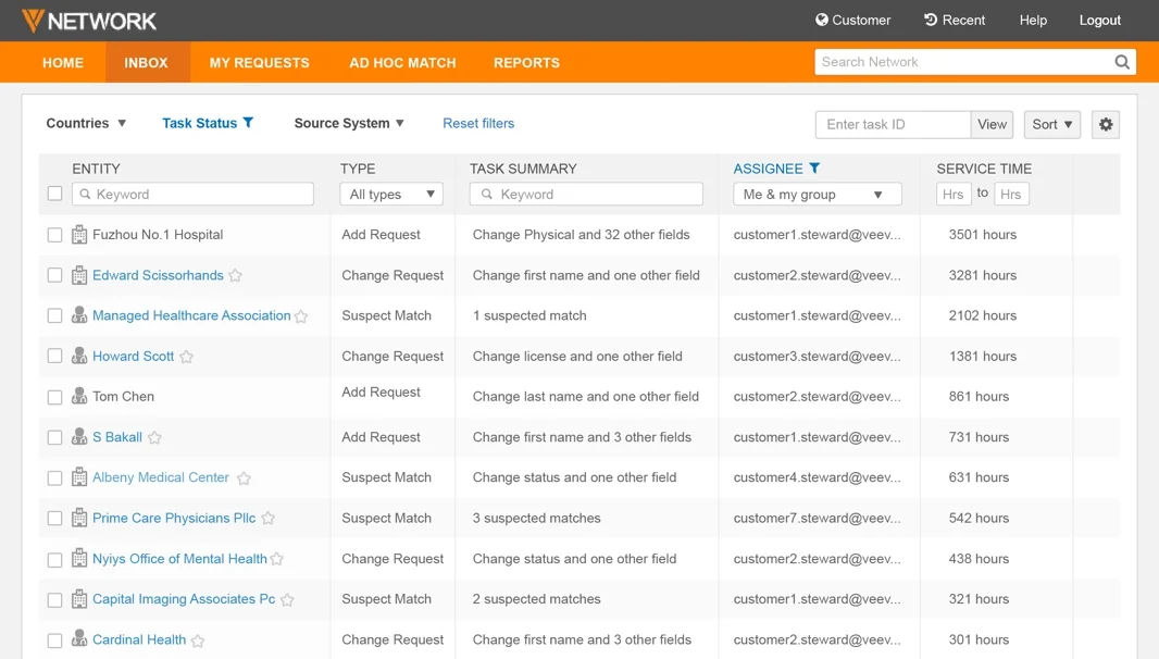
New Inbox with filterable table views
I conducted user testing to quickly validate the design by asking data stewards to perform tasks on the new inbox. Testing results showed that the new design significantly reduces task completion time and improves user satisfaction. We implemented and shipped the feature. The new Inbox helps data stewards be more efficient with their work — quickly review, process, and respond to incoming data change requests.
Data analytics made easy
Network Reporting
Our product team identified user needs for generating reports and analyzing data, focusing on two main use cases:
Pharmaceutical sales representatives use reporting to get insight into critical projects like product launches or sales planning.
Data specialists use it for stewardship operations to answer questions and manage datasets.
My task was to design a suite of reporting tools to support these specific use cases. I studied competitor reporting products and brainstormed the concepts with the product manager and data specialists, we designed two ways for different types of users to run data queries.
1. SQL query: for power users like data specialists who can write SQL, they have the advanced option to directly input SQL to query data.
2. Query builder: for business users who may not be good at writing SQL, they can use a simple form to create queries or customize reports.
Considering most users using this reporting feature will be business users, Query Builder is designed as the default tab with the ability to switch between tabs. We shipped the Reporting feature within one month. Network Reporting is announced at the 2015 Veeva Global Customer Summit, and Veeva Network becomes the first life science software with built-in reporting. Network Reporting is now one of the most frequently used features, it empowers commercial teams, data stewards and business users to proactively manage the master data and quickly gain insights from the data.


Data visualization
I also led the data visualization efforts to make data easier to use and understand. In collaboration with the product and engineering team, we shipped new visual analytics tools including Network Explorer, Product Master Hierarchy Manager, Data Quality Reports.

The Network Explorer enables medical sales representatives to visually navigate healthcare affiliations and uncover their customer relationships. It helps users profile customers faster, and target campaigns more effectively.

Product Master Graph delivers a clear view of drug products and hierarchies to facilitate product launch, competitive assessment, and global brand alignment.


The new Data Quality Report uses stacked bar chart to visualize data validation results, so users can monitor and understand data quality problems at a glance. The test details table allows user to drill down any problematic test to diagnose the root cause of issues.
Built to be responsive
To design a responsive layout for different screens, I went through each page and categorized them based on the layouts. For each page category, I designed layout templates with different breakpoints. then worked closely with frontend developers to stress test and apply the adaptive layouts to the entire web application.


What I learned
Building a design system that not only improves the overall user experience but also enables our team to ship new features more quickly. Designing data tools includes numerous testing, shadowing, and learning about users’ day-to-day patterns along with knowing business objectives and effective visualizations.
Quick iteration can accelerate the build-measure-learn feedback loop and speed to market. I greatly enjoyed the close collaboration with the product and engineering team through iterative design and development. From user research to quick prototyping, regular testing and feedback collection, the strong trust and support I had from the team helped us build the product and reinforce the fundamental value of agile product development. It was very satisfying to see my designs quickly turn into the real product which significantly improves many users’ work experience.
MORE PROJECTS


